Bloomsky Mobile App Redesign
Redesigning Bloomsky's Weather Mobile Application by prioritizing user centered design while transition from a short term growth hacking strategy
What is BloomSky
Bloomsky is a weather company, focused on building a weather network by selling consumer grade weather stations to enable the collection of hyperlocal weather data. The competitive selling point of the Bloomsky weather station was that it possessed an onboard camera, giving users a live view of the current weather instead of an icon that was often inaccurate. Bloomsky also produces a mobile application for device users to set up and manage their devices, and for all users to follow devices in locations of personal interest and need.
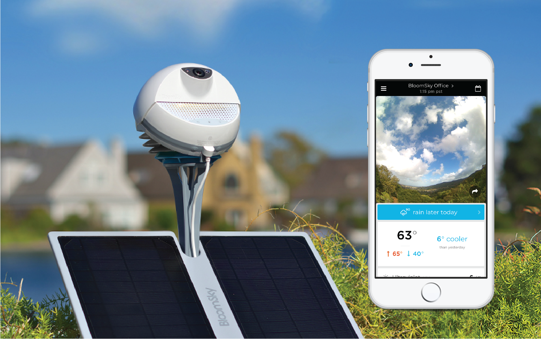
Bloomsky Device displayed with the phone application
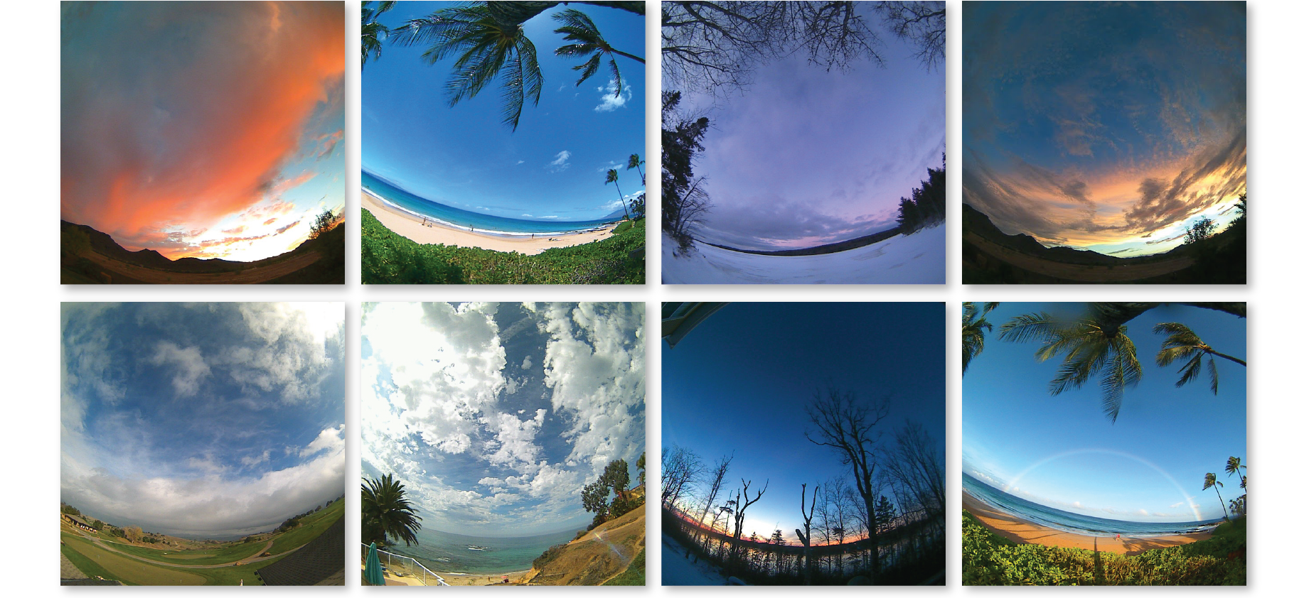
Incredible images that were caught with various Bloomskys that were distributed to customers throughout the world.
What was the Situation
Being a hardware dependent startup, Bloomsky had already spent the first year in product development with no semblance of user acquisition. To make up for the lost time, Bloomsky adopted many growth hacking strategies to stimulate product deployment with incentive programs and media campaigns. This strategy was also applied to the mobile app with the rationalization that with Bloomsky’s weather images, we would use the distribution power of social media to create viral growth. The app placed emphasis on favoriting devices, sharing photos, and acquiring followers. After a half year, it was determined that even with a high number of application downloads due to ad campaigning, we were experiencing difficulty with retaining users. The expectation that users would share photos was overestimated, and the app store ratings had hit an all time low due to poor user experience.
Grievances of the original app
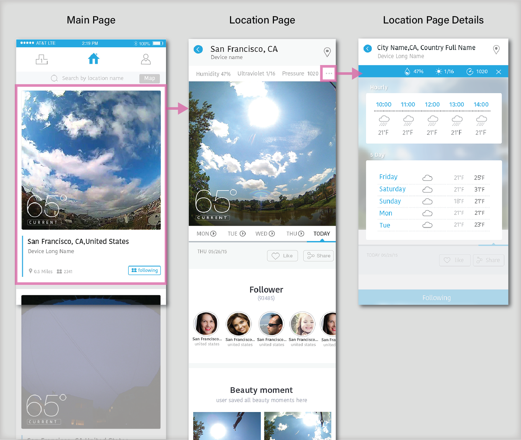
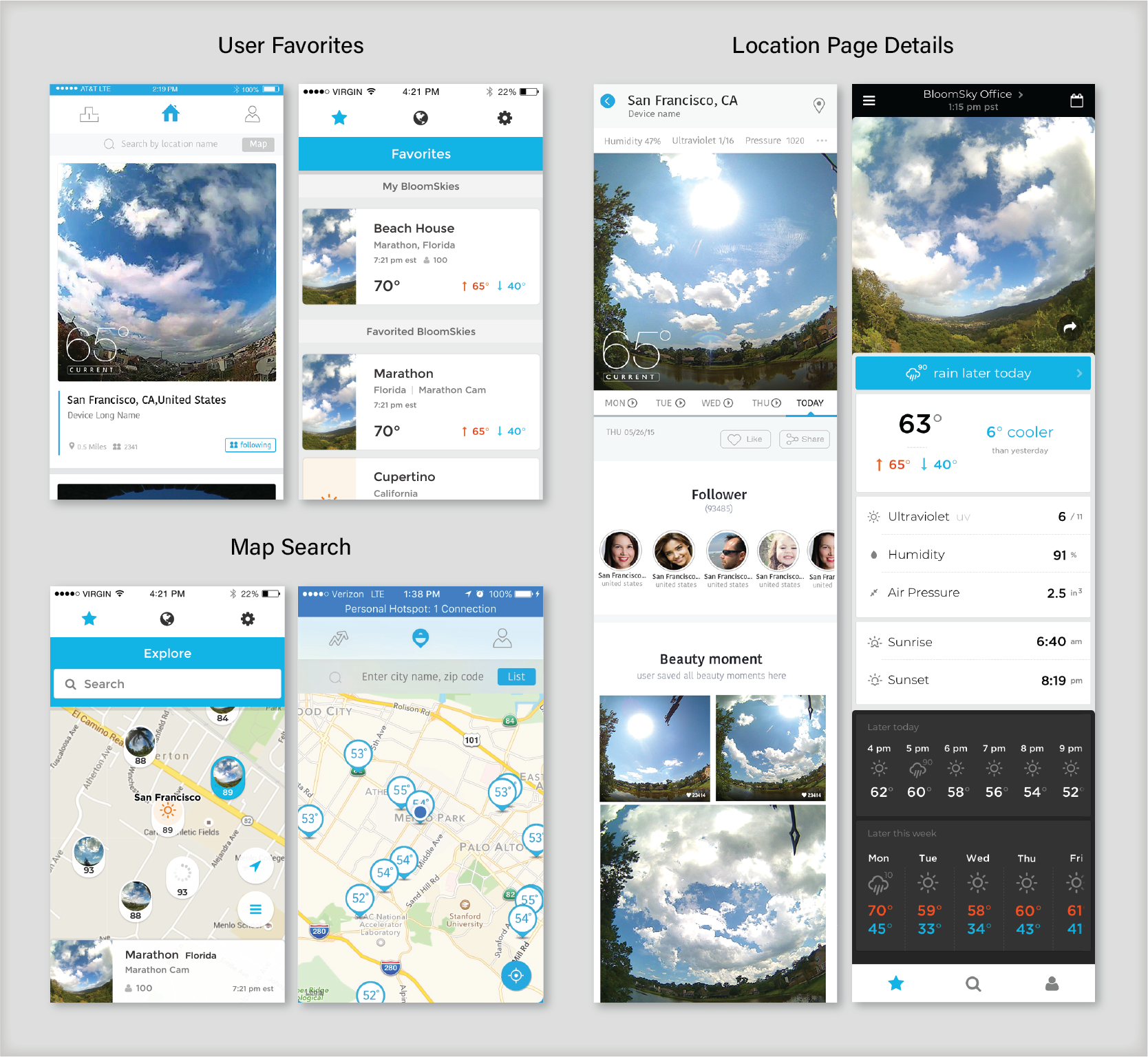
1. The Main Page that contained all of the user's followed devices prioritized large imagery instead of usability which meant only one location could be viewed at a time and would require an excessive amount of scrolling
2. The Location Page prioritized social media information such as follower count and saved imagery while other data was hidden on another modal on the Location Page Details accessible by a meatball menu
3. Access to the weather map was de-emphasized in the search bar on the Main Page.
4. Actually weather data which was superimposed on the imagery was difficult to read and many other semi-relevant text was at font size so small that it no longer fit within accessibility guidelines.
Key Points of the Redesign
The redesigned application fulfills the needs for the basic weather application user.
Accessibility and usability are upmost priority
The design should account for shortcomings that could occur due not yet reaching device saturation.
The app offers features that provide users with greater understanding of the weather.
Goal of the Redesign
Reduce bounce rates from user acquisitions from ad campaigns and increase the number of daily active users.
Project Execution
Due to the constrained timeline, the mobile app was performed in two stages. The first stage which was allotted one month from start to appstore submission addressed user experience while placing heavy consideration in what the app developers could simply modify without any major code changes. This greatly limited what we could change as the new iteration would need to retain the same general framework
The second phase which was allotted two months had significantly more polish to the overall design aesthetics with a handful of new features.
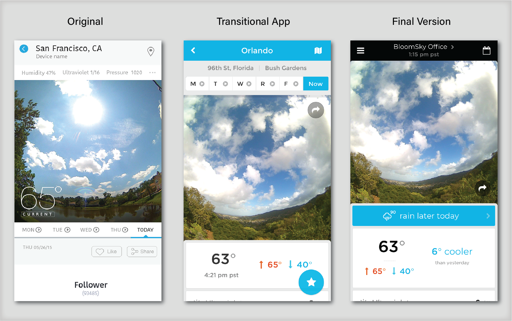
From left to right showcases the changes that we made to the app. The Transitional App could only allow for the rearrangement of assets whereas the Final Version added new features.
Redefining a User and MVP
We reworked the app to target the needs of the everyday weather app user who used these apps to plan their day. The aim was to build an app that could become a full replacement for apps such Yahoo Weather, Weather Underground, and other 3rd party apps that could fulfill the needs that were not covered by Google's and Apples native widgets and applications. We were catering to the users that specifically used weather apps to plan their day.
This was necessary step since we had not been able to successfully identify a "niche" user to target, therefore it made sense to build for a user that we knew already existed. The main challenge would be how we could leverage our live images and hyperlocal network to acquire customer share in what was already a competitive market.
Because we did not plan on making two mobile applications, the application also needed to fulfill the needs of the device owner. Other than the ability to configure their devices, we did not have the capacity to really dig deep to research and build any new tools and features so the functionality did not undergo and major changes for this app redesign.
Main Points of Redesign
The app required a complete makeover which required a complete restructuring and redesign.
In order to refresh the look and feel of the app, we redesigned the app with accessibility in mind, making relevant data easier to read, and ensuring that data that users wished to access within user expectations.
User Experience & Information Hierarchy
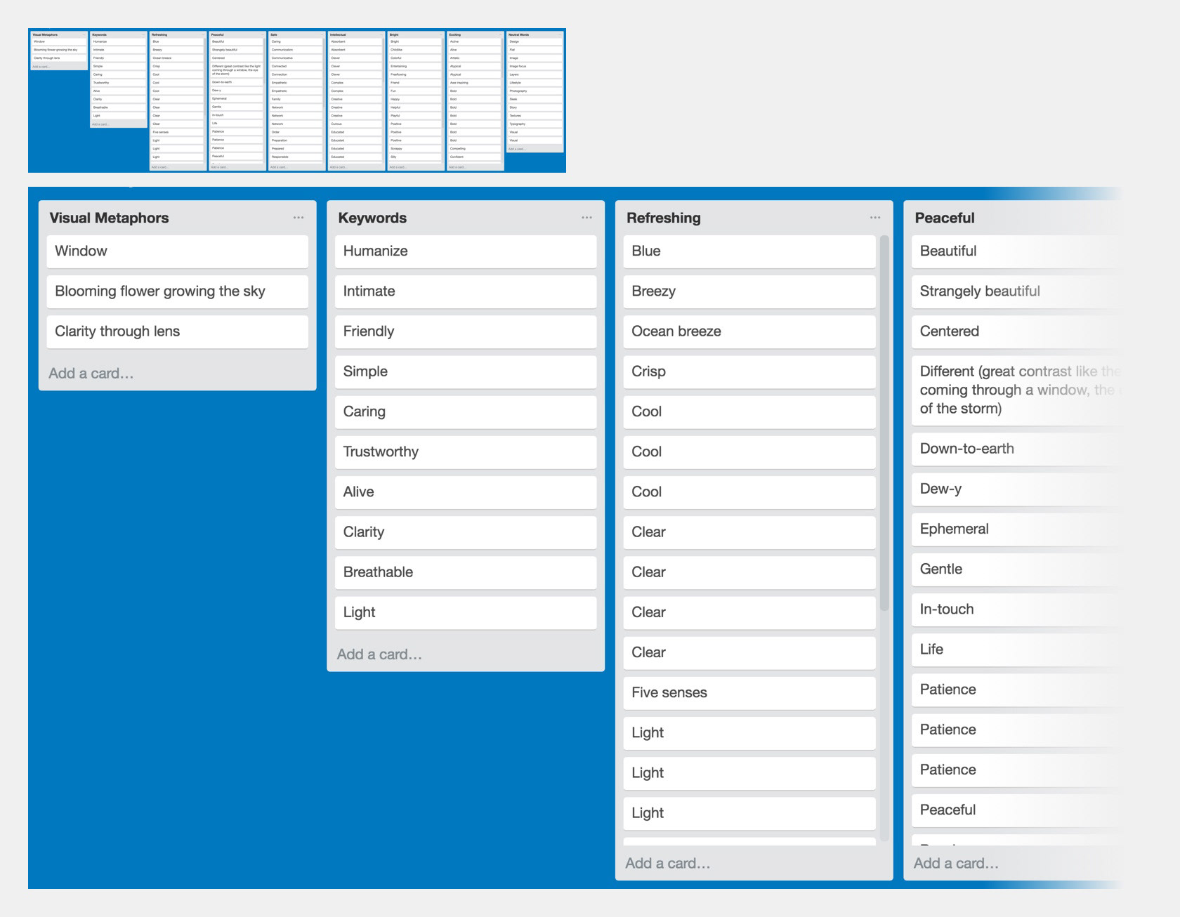
To restructure the app, we visualized the full application's layout with an information architecture chart so we could fully illustrate every component and it's location. For each location page we used a Trello board to create an exhaustive list of possible data points then used competing applications to discern what people found was important. A UX wireframe was generated for every portion of the app, prototype, then tested with users to ensure there were no major issues with the established flows.
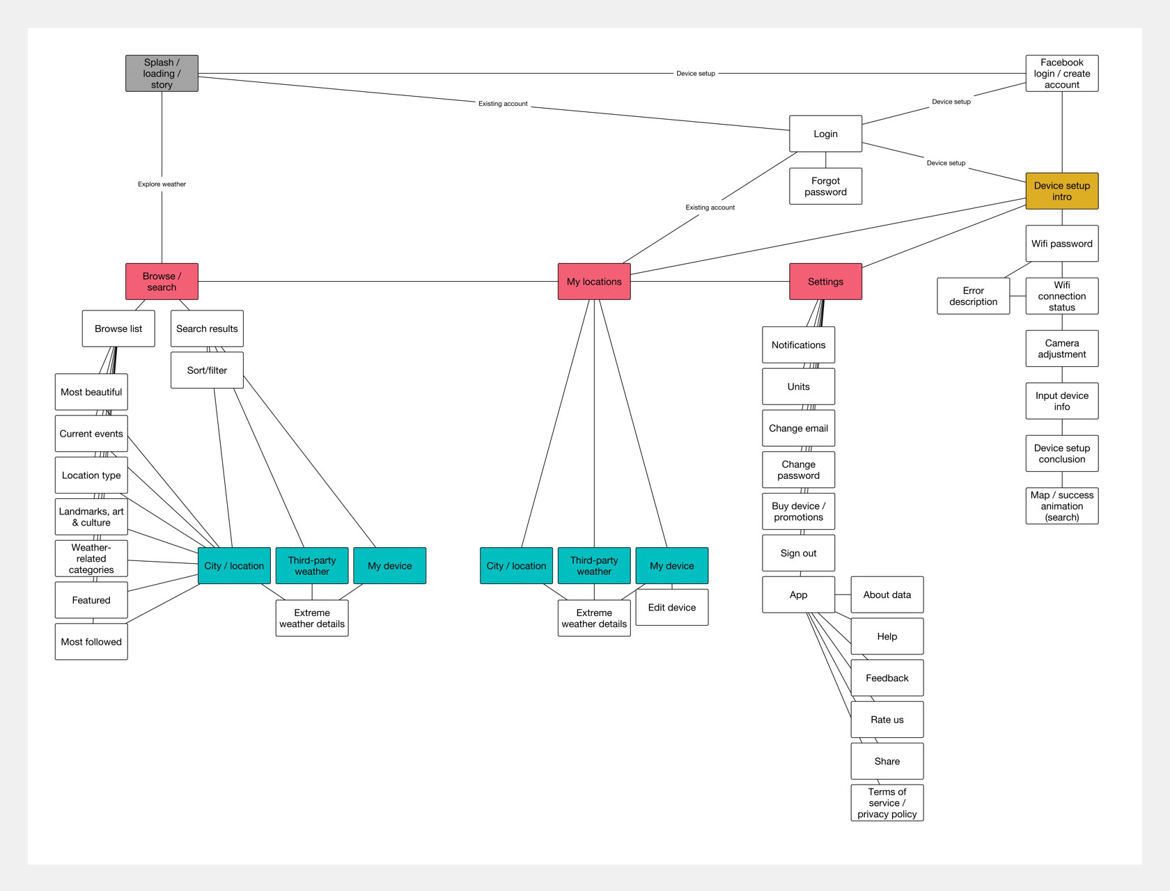
Information architecture flow that shows the removal of the "Trending" tab.
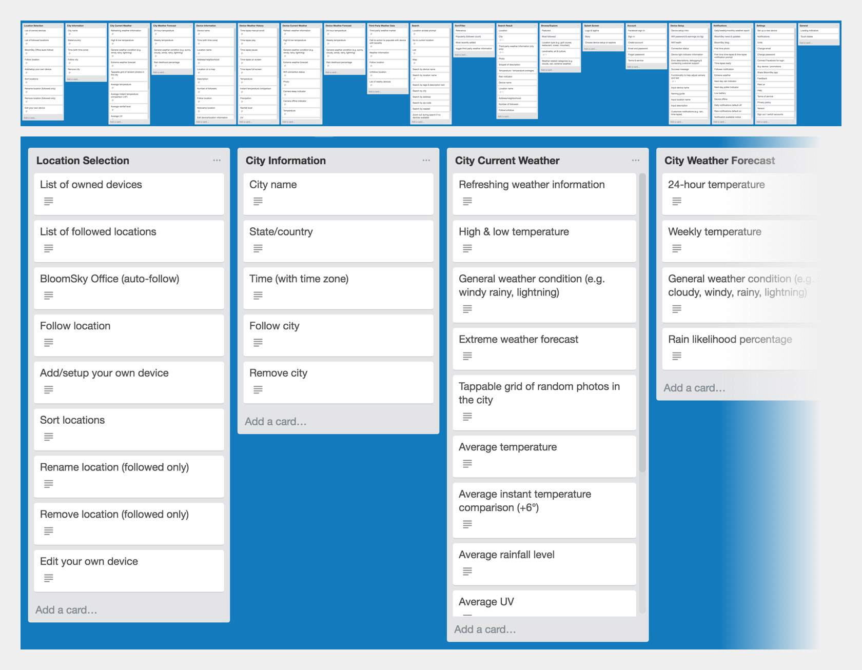
Exhaustive Trello Board that listed every possible data or informational point a user may find relevant.
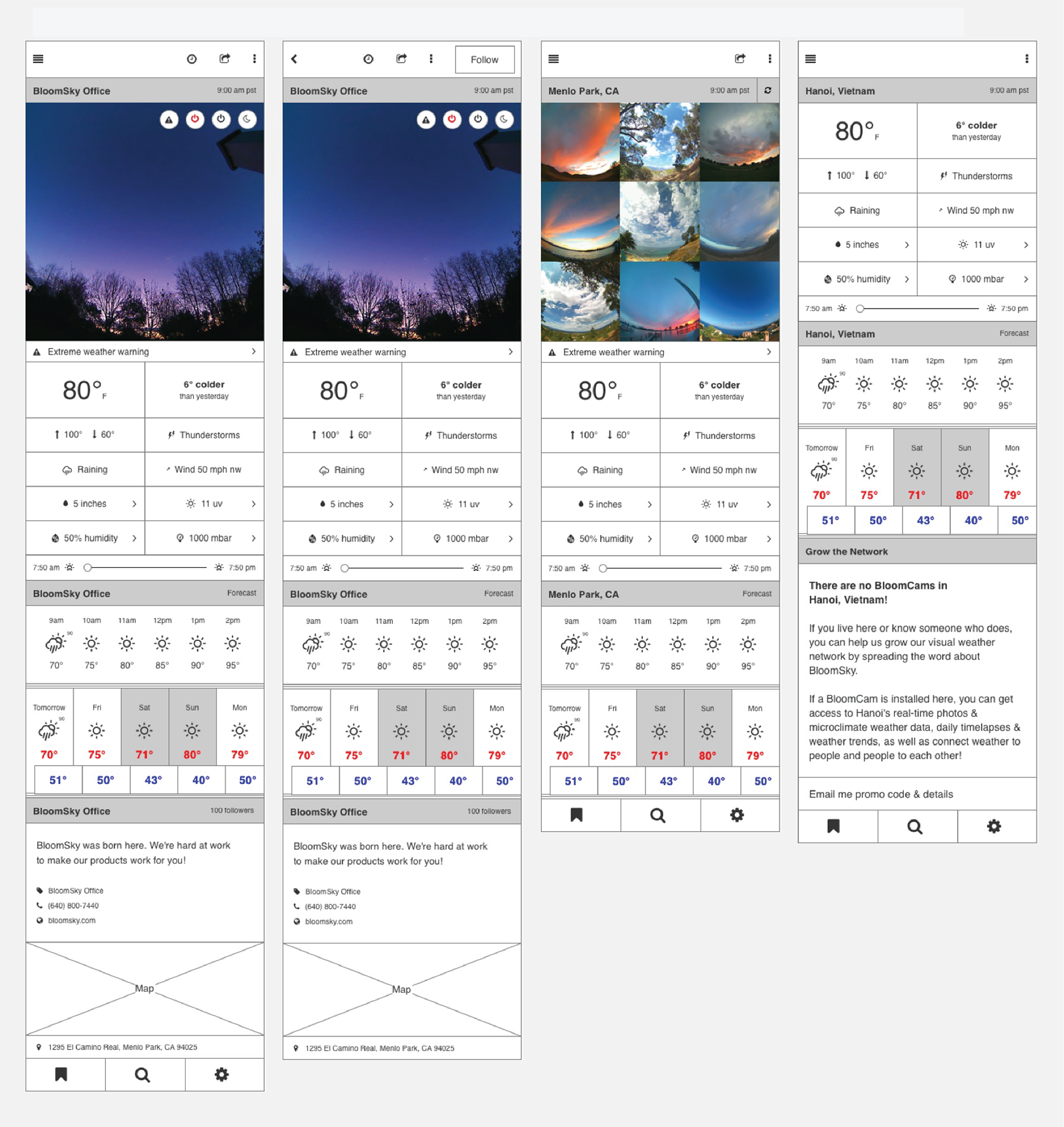
UX wireframes with data laid out for the Location Screen
De-emphasizing Social Media
We had initially dedicated one of our main tabs to showing people devices that had many followers and favorited images, but discovered through analytics that the majority of returning users did not bother interacting with that page. We removed the trending tab and replaced it with a local weather map with all of the nearby devices plotted and search that was originally on the favorite's tab.
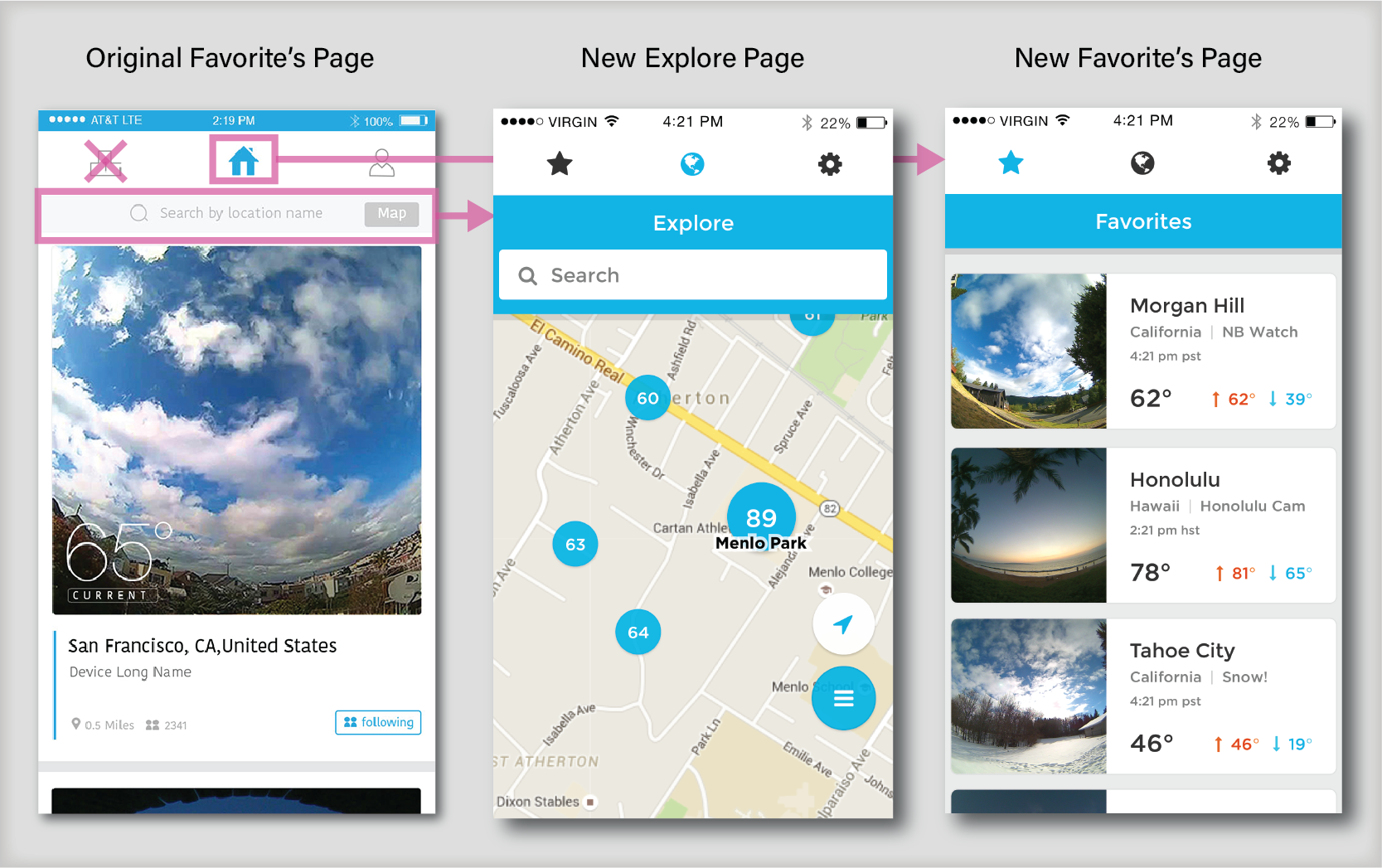
The Trending Tab (left button) was removed entirely and replaced with the Favorite's Page. The search bar then received it's own dedicated tab as the Explore Page while showcasing a populated map
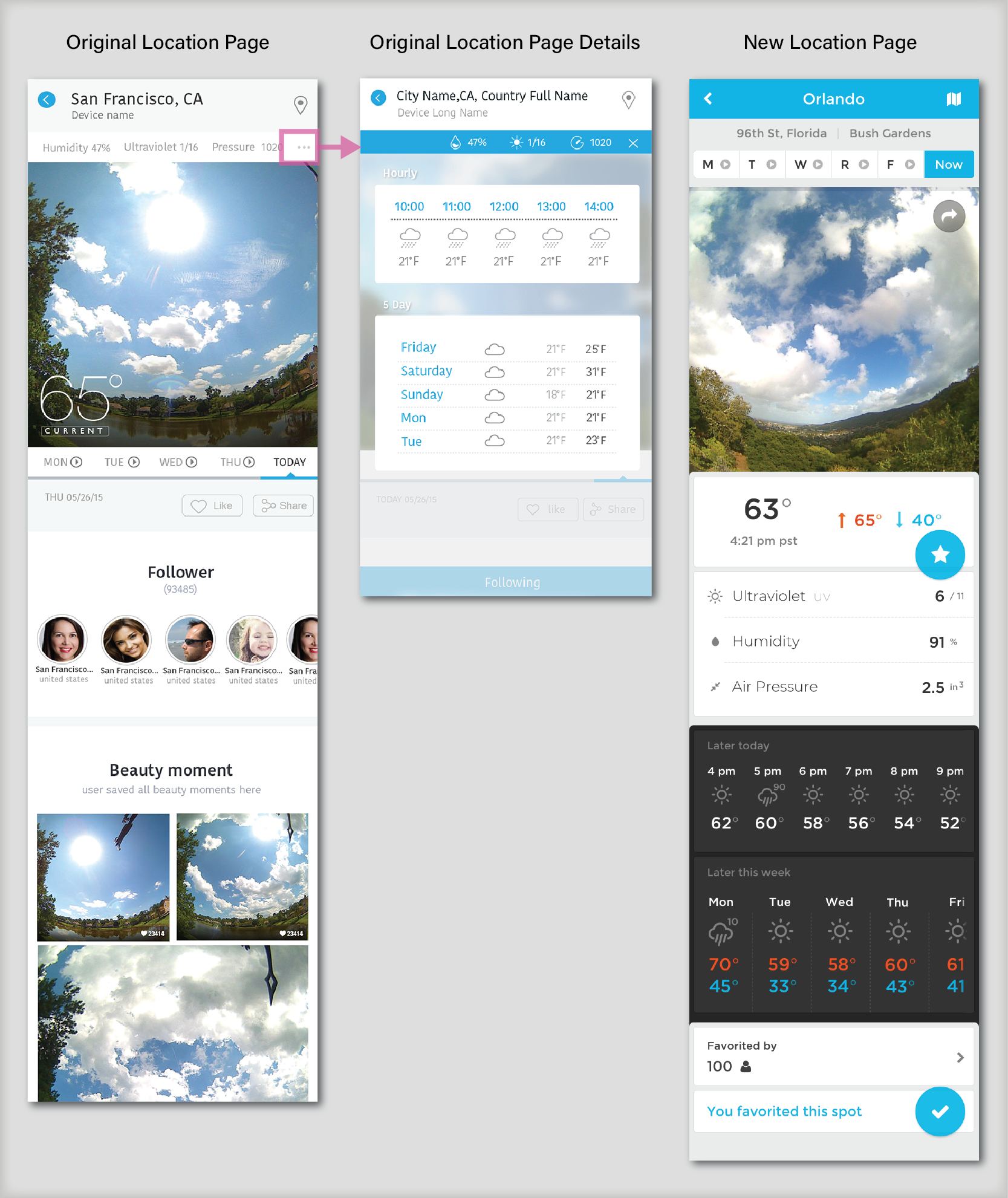
Location pages de-emphasized the followers and photos in favor of ensuring all relevant weather data was accessible to users on one singular page. Originally the weather forecast of a location was hidden behind a hamburger menu.
Visual Communication & Branding
When approaching the branding we wanted to choose something in between what our company represented and make it approachable and inviting. The progression of work went from terminology brain storming, mood boards, the finally a visual guide.
Organized word clusters after a brainstorming

Mood board based off of our keywords brainstorm
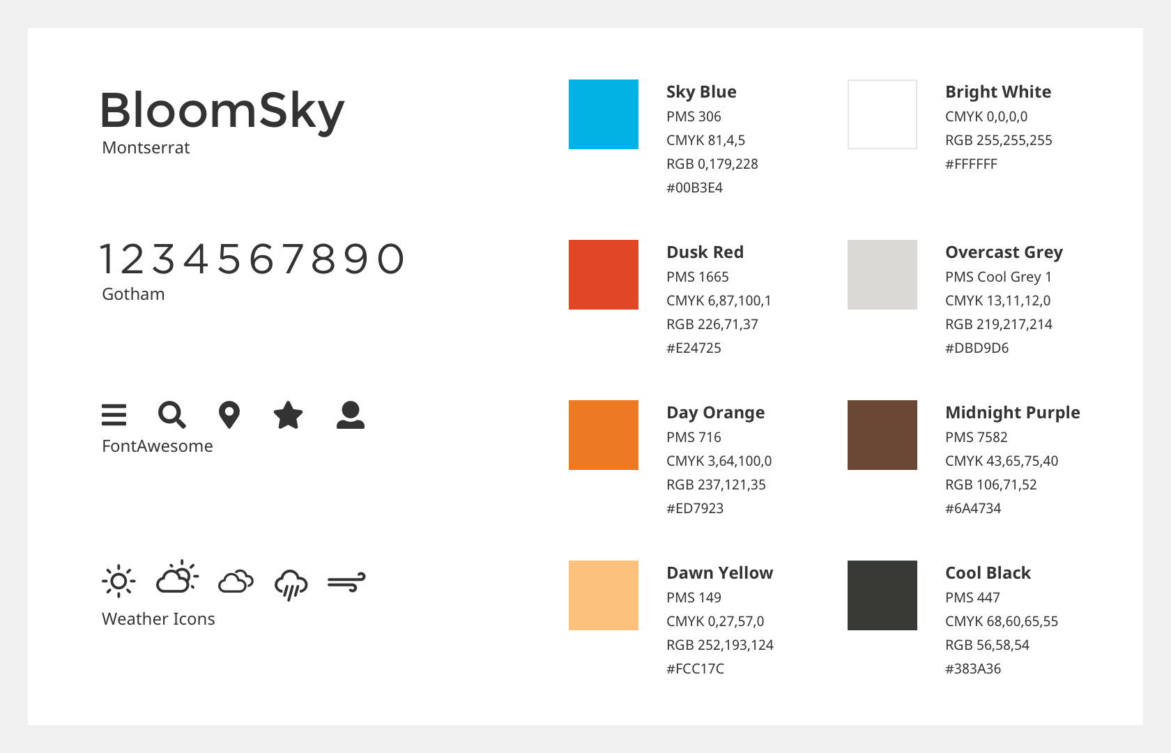
Established style guide for the finished application
Old App on the left and new revision on the right
Innovative Additions
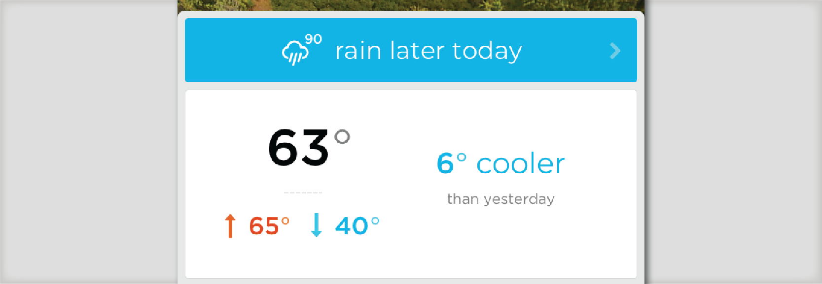
In addition to having a live image of the area, we thought of various other methods of giving users a much more vivid mental and physical image of the area of interest.
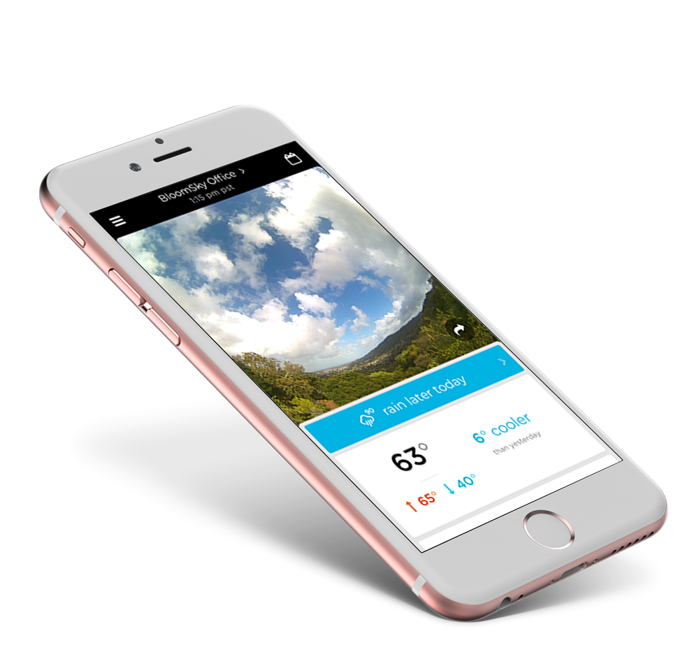
We came up with the idea of displaying relative weather. It came down to the understanding that one of the biggest reasons why someone checks the weather is to avoid discomfort. While a weather app is probably far off from suggesting what attire one should wear, it certainly can tell you how the next day will be different from the current day. Users can then use their own body as a measurement tool to inform their future attire decisions.
Results of the Change
App Store Rating
30% increase to our app rating from 2.5 stars to 4.2 stars across iOS and Android within 2 months of launch while still not being completely bug free.
Increase in daily active user count
400% increase in daily active users from 600 daily users to 2,400
Increase in engagement
500% increase in average time spent per week from 5 minutes to 25 minutes. Average number of screens viewed per session increased by 300% going from 2 screens per session to 6 screens per session.